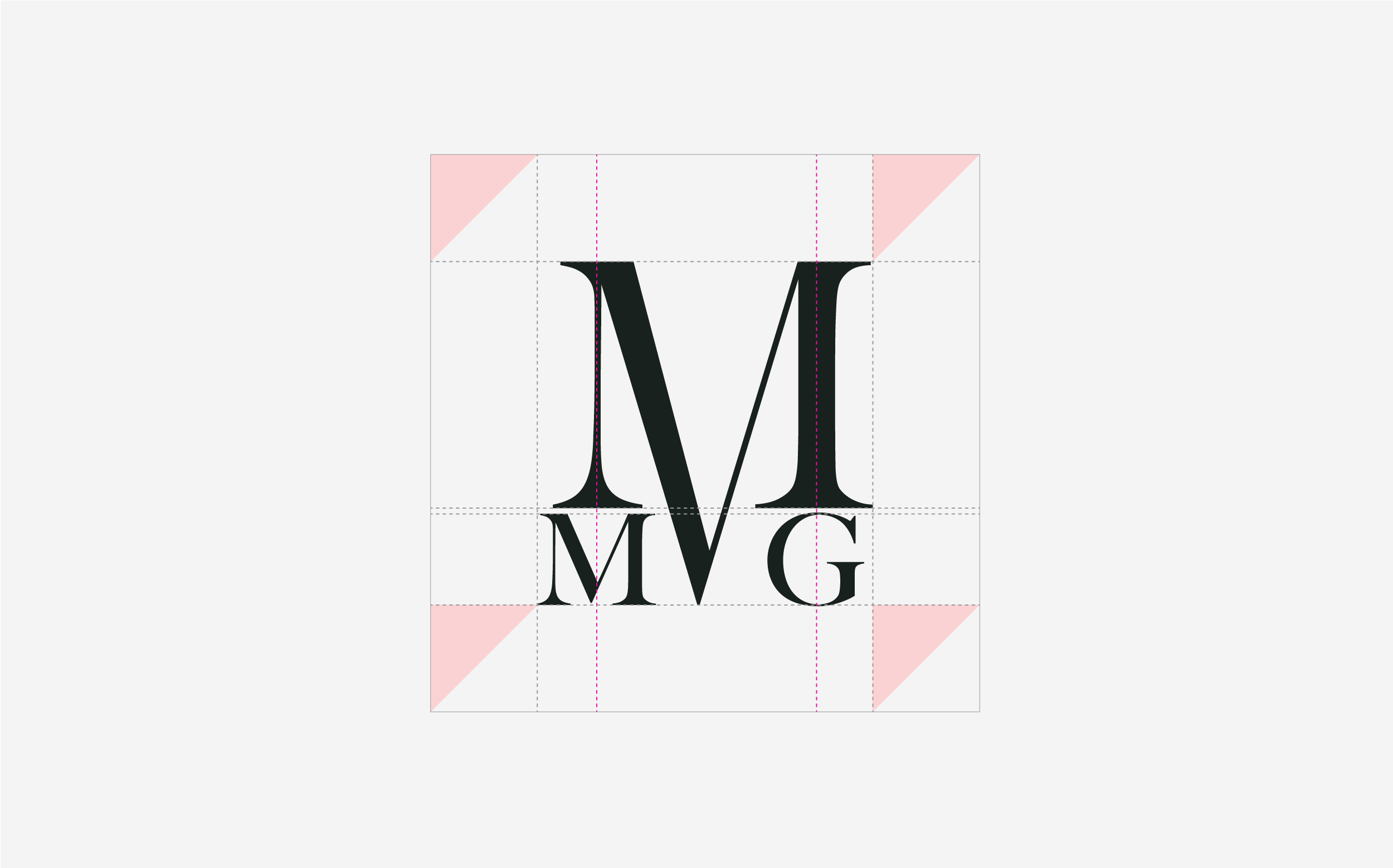
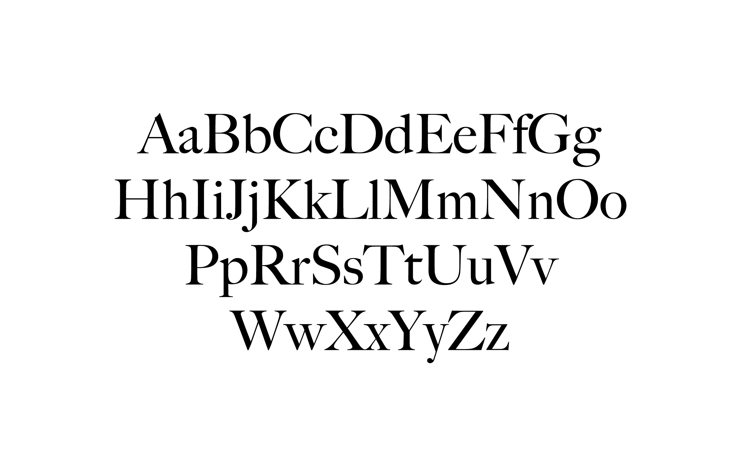
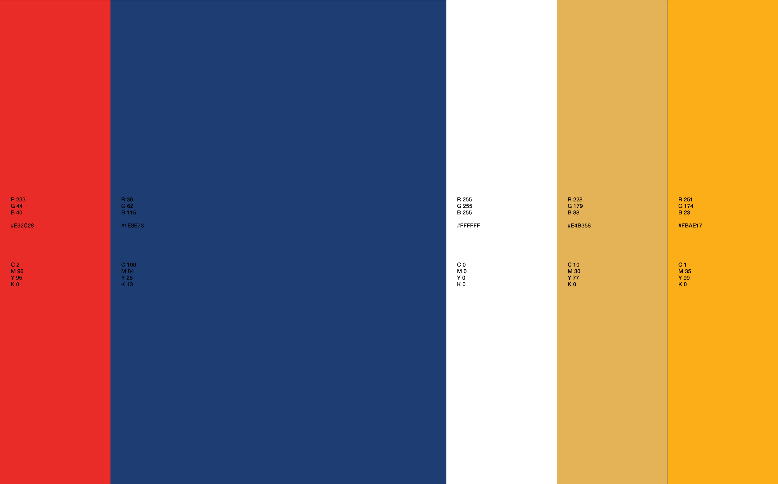
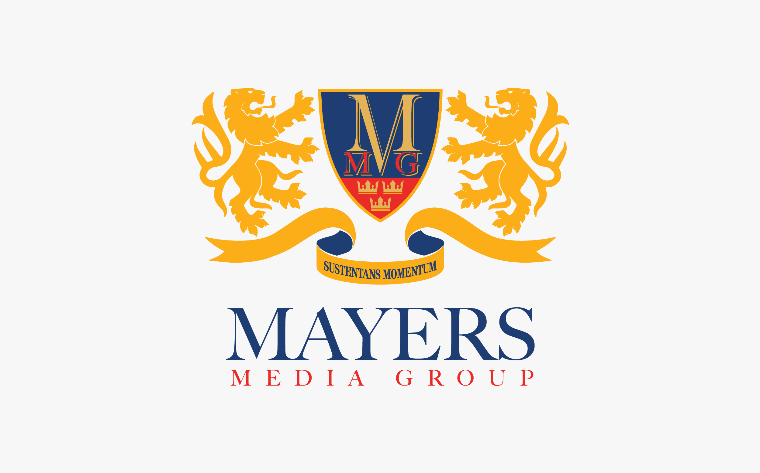
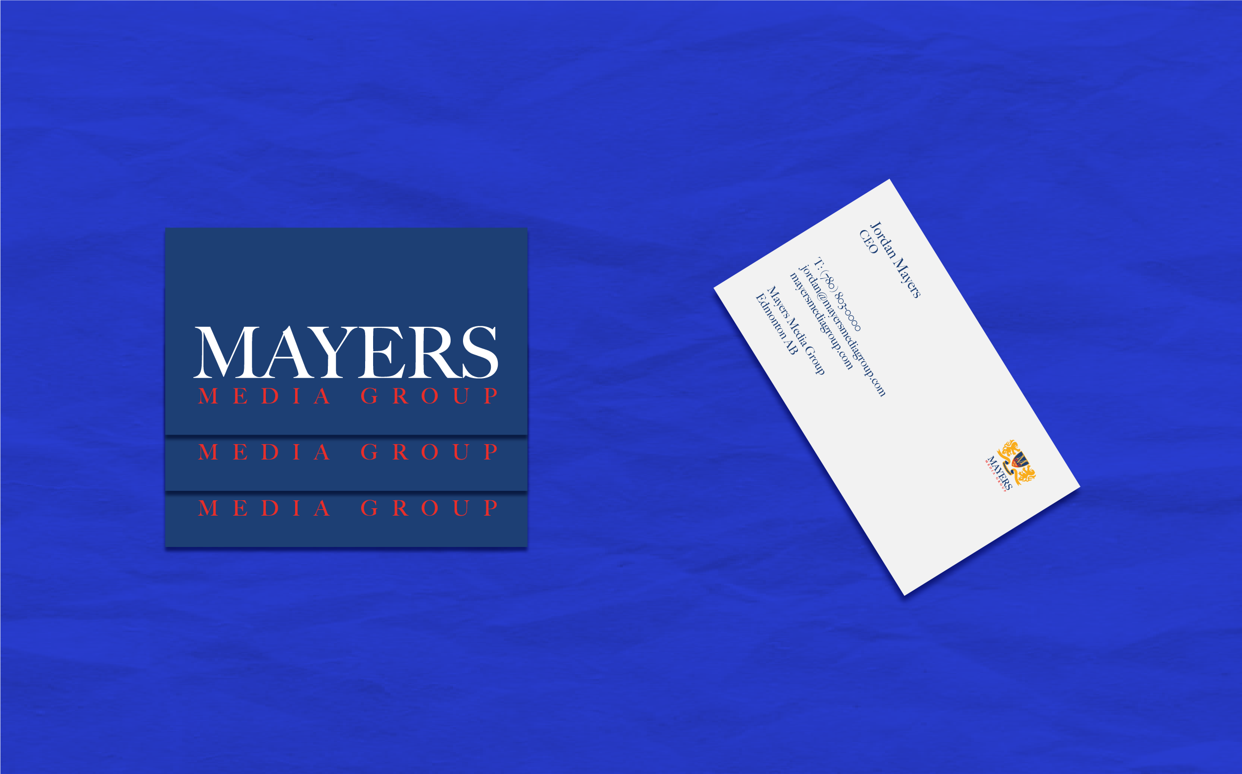
The visual identity conveys Mayers understated approach and distinct character. A striking, graphic symbol has been introduced that reflects the firm’s strong culture and working style. The extended crotch of the letter M serves as a visual metaphor for Mayers creativity rooted in thorough strategy. Red and blue colour palettes and Caslon typeface, as well as layouts reflect the firm’s heritage and background.
Mayers
Visual Identity for marketing agency in Edmonton
See more +