Udobnost is a family owned company that has been producing quality home furniture since 1996. They combine modern design with industrial craftsmanship, inspired by the simple joys of everyday living.
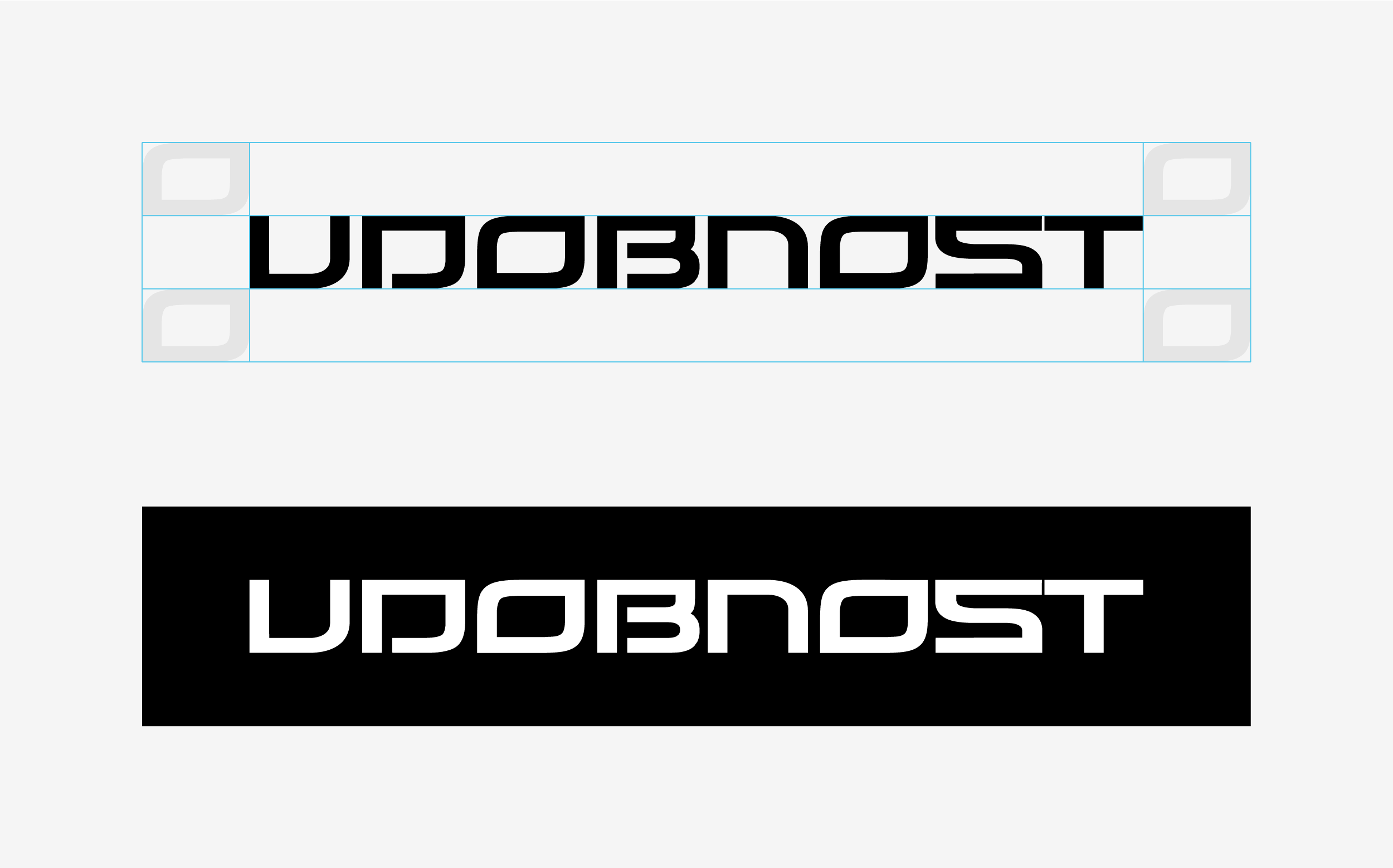
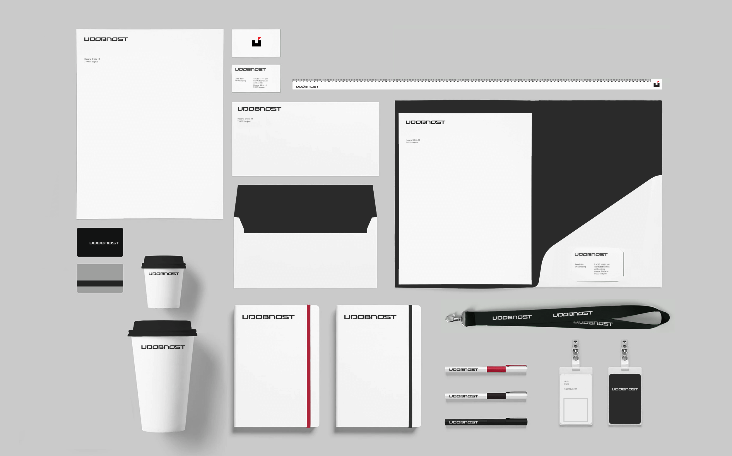
Lazar Oljaca designed a new identity for Udonost inspired by the carpentry artisans, creating a symbol representing a seal of Udonost's quality and precision. The symbol is both abstract and literal, creating the appearance of a tangible sitting object. This icon serves as a visual shorthand while creating a memorable symbol that supports the brand's values.
The new identity accelerated Udobnost's growth from the local to the national level, and they expanded from twenty three locations in 2008 to over three hundred stores in 2010.