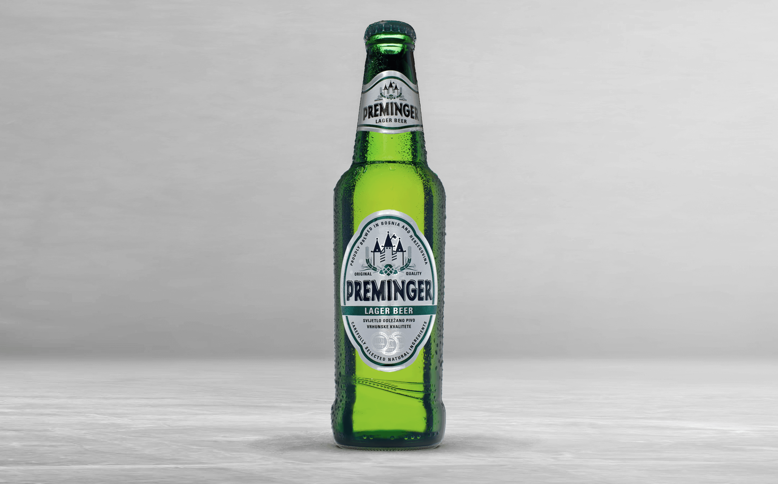
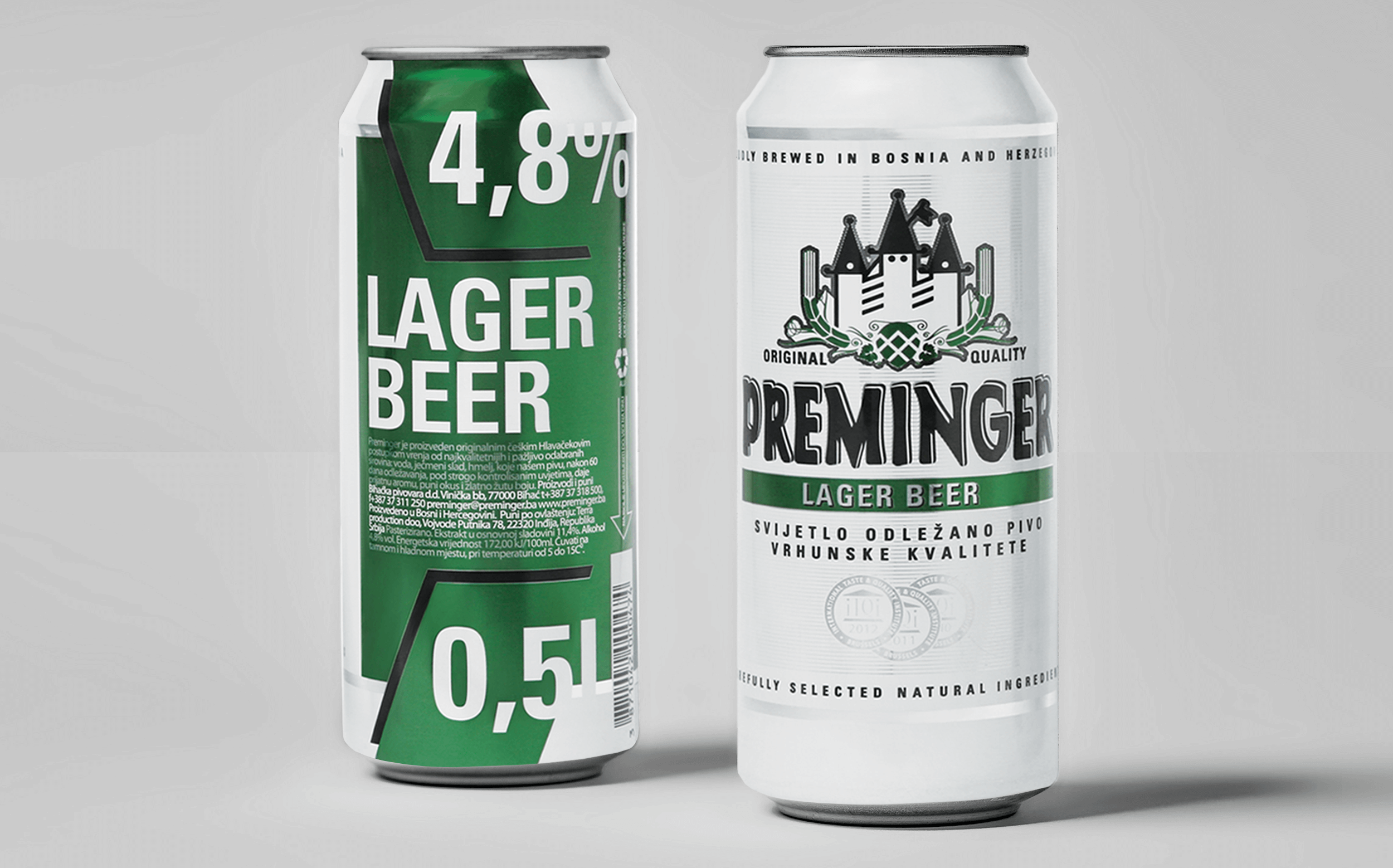
Lazar Oljaca designed a new brand identity packaging design for the Preminger Brewing Company, founded with the intention of producing premium beer that sets the bar for quality, is easy to enjoy and accessible to everyone. Preminger gives plenty of fruity hop aromas, which give way to a beautifully balanced malt backbone. Fresh and smooth hops ensure the beer is crisp, clean and offers a refreshing, lingering light bitter finish.
Preminger approached Oljaca to create an identity that would help the brand stand out in a overly saturated beer market. The design team took a bolder traditional approach using typography and a green color on white background to reinforce a premium product. With a slightly playful and industrial look and feel, the Frutiger typeface is used on Preminger's packaging and other applications.
The Preminger founder explained: “We wanted a design that could stand out and look fantastic, while also making it easy to explain what's in the can and who made it. The team at Oljaca understood what we were trying to achieve, they listened, and took our ideas to a higher level. We were delighted with what came back and how it developed. And it's been working, the response has been fantastic. Our beer is delicious, but we don't underestimate the power of standout packaging, which does the job of breaking through the saturated beer market."
In one year's time, The Preminger beer took off from a local brewery to internationally recognized beer.